Friday, 12 December 2014

Textual analysis of my chosen media for mock exam


Dover Self-esteem advert, 2012.

Mise en scene: What the girls are wearing represents age because this is what the girls this age would have to wear for these certain activities. Two of the girls that are in the advert are wearing leotards, and the second girl that you see wearing a leotard is wearing joggers over the top, this then implies that she does not feel comfortable within how she looks and is wearing the joggers to cover up her legs as she is not comfortable. The final girl that you see is wearing a swimming costume that fits her fine, but she looks down and ttys to pull it up even more as she is trying to core her body, shortly after this she puts he arms around her stomach so this also implies that she is trying to hide her body away.

Camera angles/ camera movements:  The camera angles make sure to show other individuals doing the sporting activities whilst one of the girls is making it obvious that she is not happy with the position that she is in and that she does not feel comfortable. This then shows the other girls participating within the activity and you begin to understand why they may not want to participate. The camera angles also make sure that you can see the girl who does not fell comfortable doing the activity doing the sport and they sen fine but then after they have done it they look very self conscience and you as the audience can see ho w conscious they are. This then gives the impression to the audience that this is a serious issue and many, many girls feel this way about themselves and you feel sorry for them because of how these young girls are constantly targeted to look a certain way. The camera angles are also very effective because when they focus on the girl that feels uncomfortable and unconfident they put the camera angle at their level which means that as we are looking at them on the same level as they are at, it then could imply that we are looking at life for them from their level also. We are then seeing what life is like for them and how they view their everyday life and activities This then also means that we get an insight of how they see things and the way that they are feeling.

Lighting: Soft

Colour connotations: The colours used throughout the advert have been slightly dimmed because although all of the girls are wearing bright colours but they have all been slightly dimmed to match the genre of the advert. As, if the genre and mood of the advert as still as it is and they had all bright colours then it would not fit the genre of the piece due to the fact that the mood of the piece is very emotional so the dimmed colours fit he mood of the piece well. Also after you have seen all of the girls at their sporting activities it shows all of the girls at what looks like an activity day helping raise self-conscious awareness and making girls feel better about themselves, as this is a change of mood from previously in the advert the colours have become a lot brighter implying a happier environment and a better situation in which the girls feel better bout themselves.

Editing techniques: They have used different clips of different girls doing a variety of different sports, e.g gymnastics, swimming and ballet. This is effective because it then gives more than one example of how this problem is effecting a wide variety of young girls, and affects people in all types of sports. This also then shows the amount of girls that are feeling the pressures of society and in the media. Young girls feel pressured and very bombarded to look a certain way and to be a certain size and body shape, and as a result of this many young girls are willing to give up their hobbies that they enjoy and may have extreme potential in, just because they do not feel comfortable in how they look in what they have to wear for their particular sporting activity.

Sound: Non diegetic, this then creates more of an emotion throughout the advert as it is an emotional song as the advert is about an emotional topic.

Enigma code:

Wednesday, 3 December 2014

Annotations of double page magazine spreads


Main image: They have used a close up of the top half of Lady Gaga's body. This is to emphasise her body language and facial expression. It is a very posed and laid back image. The way that she is posing with her hands across her best shows that she is showing her feminism to the audience and that she is not ashamed to be posing how she is whilst wearing minimal clothing and posing with a very sexual and intriguing look on her face that draws the audience in to the image which then draws the audience into the article as well, this means that the main image doe sits job to  help advertise the text. Her hair and make up has been done in a 60's style to attract a wider audience and also to show her individuality as an artist as nobody else has their hair and make up like this so this then expresses her individuality as an artist and her individually as a person. 


Columns: 3 columns in a simple layout that are all exactly the same and this then gives the page a classy style and layout. 

Drop cap: The drop cap of the 'S' attracts the audiences attention towards the text. 


Main image: The main image is a full body shot of Cheryl Cole. This then advertises her figure and the clothes that she is wearing. Also the clothes that she is wearing are very high end fashion, thesis interesting because she has been made to be very sexualised so although men will look at this and say that she is a very stunning icon, women still want to buy these clothes not only for the attraction from men because the men do not even know what kind of fashion they are or how high end fashion they are they just think about how good Cheryl looks in them. Women often buy these high end fashion items more to impress women that to get the attraction from men because as men do not know much about high end fashion whereas the women will know what makes an brands she is wearing and then therefore want to buy it to impress other women.

Columns: As the columns are the exact same size and shape this gives the magazine a classy look.

 Drop cap: The drop cap of the 'I' attracts the audiences attention towards the text.


Main image: Attracts the readers attention and also because it is a different colour scheme to the others, the college of the other images also attracts attention to the main image as they are smaller than the main image so the eye automatically goes to the main image. As the main image is a non forced or non posed image it gives the picture a much more relaxed look, this then makes the fans feel that they are with the band and that they are getting exclusive footage and images because they are just casual pictures of them on tour just being themselves so the fans feel a lot closer to them and feel as they are getting information that nobody else is as it is not about the main things that they are doing it is about extra non-exclusive things that they are just doing as a band.

Columns:The columns are all about the same size so this then gives the article a classy look, also the quote in the middle of all of the text draws attention to the text within the magazine.

Drop cap: The draw cap on each of the new paragraphs draws attention to the different parts of the article because they are a different size and different colour they make the article look more 'indie rock' like the band that they are talking about which is good because this then means that all of the magazine article has the same theme.


Thursday, 13 November 2014

Essay

'Write 500 words on how your research has helped you with your pre-production and who your target audience is and why?'


The researches that I have completed to help me come to my final outcome of my pre-production are: my questionnaire and textual analysis. These have had a big impact on the type of pre-production that I came to finally decide to make. As, these were the indicators that helped me to make my final outcome. They were useful because they helped to make my product appeal to a wider and more diverse audience because I tried to use the features that the majority of people who filled out my questionnaire voted for and wanted to see on my CD cover. So as I went with the items with the highest votes it should attract a wider diversity of people, as it is what they answered and what they want to see on a CD cover when they buy one. From my questionnaire I could not only see the features that my target audience most wanted to see on a CD cover but also the factors that they most disliked for certain reasons and did not think were important, or want to see on a CD cover. This was then very useful to me as well because then I could try to work out reasons why they may not like this particular feature and try make sure that my CD cover did not have the certain elements that they did not like, whether it be the main image, fonts, colours, the artists name or even the structure of the CD cover.  My textual analysis has also helped me to come to the final outcome of my pre-production CD cover because as I analyzed different CD covers I saw what other features people put into their CD covers that looked effective and made them unique so I could then try and come up with and include different elements to my CD cover as well. It was also interesting to find out why certain CD covers had specific elements on, as I could then interpret this into my own work and try to make it up to the highest standard possible.  My textual analysis also allowed me to pick out specific elements from the wide range of CD covers that I looked at and analyzed, this then allowed me to be able to pick out the parts that I liked specifically and change them slightly to include into my own work to fit the genre, theme and style of my CD cover.  My target audience is teenagers ages 15-18 and a few of my target audience were up to the age of 41 and slightly over. This is the age range that all of the people who completed my questionnaire were aged between. This age range is also my target audience as this is around the ages that this specific genre of music is aimed towards and that this particular age range listen to, enjoy, and also who the artists themselves aim their music at.

Wednesday, 5 November 2014

CD Cover textual analysis


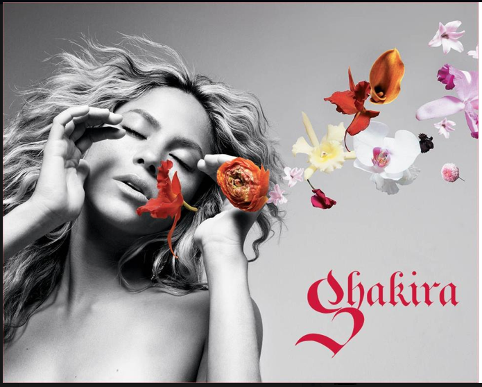
Main image: In the case  of this CD front cover there is a single image of the singer Shakira. The image is used in a classic way having her posing with flowers coming from her mouth upwards like musical notes. The face is big enough to stand out and to make it obvious to the audience about who's album cover this is. The singer is not making eye contact which then makes this CD cover unique and therefore stand out in a shop against other CD's as normally if the singer is on the front they use direct eye contact to help draw attention. The opposing colours make the CD cover look effect because the main image is black and white and then the flowers are very bright so they contrast one another and give the CD cover a more girly approach, with the flowers, Shakira's hair long and curly and the word 'Shakira' in bright pink.


On this CD cover Adele's image is prominent so this then attracts the audiences attention as they will know that it is her album and therefore attract her fans. In this case there is not just one single image, her man image is the most prominent and then there are 3 smaller images going vertically on the side. So these images are a completely different angle to the main image. She is pulling a natural face in the main image and then the 3 smaller images are of her posing. This could indicate the fact that she is still a normal girl ( the main image) even though she is now famous (the 3 images on the left) as she became famous so quickly. The CD album name is a contrasting colour to the background on which it has been placed so that it is clear to the audience that this is the name of the CD and the names of the songs are slightly smaller so that they do not draw attention from the main image of Adele or the name of the CD.


On this CD cover there is only one main image. The image is used in a very model like way with the girl posing sitting down with her classy outfit, her nails done, her hair all up and her heavy make up. The use of the cross is very effective as it says perfectionist. This implies that the models face is not as perfect as the 'perfectionist' wants so they have crossed it out. It is also very effective because it is red which implies danger. The fact that the CD cover is also outlined in red could imply that she is surrounded by danger.


Wednesday, 22 October 2014

Questionnaire analysis


Q1:) In my 9 responses 90% were between the ages of 15-18. So as this was the majority vote from my survey I will aim my CD cover at this age range. I will have to incorporate certain things into my CD cover that I think that this particular age range will like and want to seen a CD cover. 


Q2:) 60% of the audience that filled out my survey were Female, so I will be aiming my CD cover more towards girls as they were the majority of my audience. I will try to make sure that the cover does appeal slightly to men also so it is not all completely one sided, however I think that it may appeal slightly more to girls as I will be aiming it more towards them due to the fact that they were the majority vote.


Q3:) From my survey I have come to the conclusion that the type of music that my audience prefer are HipHop and Pop. As Pop got 40% and HipHop got 40% also, the final 10% was Indie rock. I will have to make sure that the song that I choose has a genre that people are interested in so that the audience are more likely to watch it as it id the genre of music that they are interested in and want to listen to, which will then therefore make them more likely to want to buy my CD.


Q4:) From this  question in my survey I can tell that only 20% of my audience only watch the music video depending on who the artist is. This means that I have to make sure that the people on my CD cover could maybe portray the storyline in the CD cover and that my CD cover is interesting so that people want to buy the CD cover and will want to listen to the song. I will also have to make sure that my CD cover is unique and individual to others as this is what is going to make more people likely to buy it if it is not like others. I will have to make sure that my CD makes sure that it makes the artist look good swell, as this was also voted for by 20%, and this could have a big impact on my CD.


Q5:) From this question in my survey I can tell that the artists name is definitley thought of as the item on the CD cover that appeals to the target audience is 'The artist's name' so when I make my Cd cover I will have to make sure that the artist's name is effective and stands out as this is what the audience want to see most on a CD cover. However, the audience thinks that the image is quite a large part that an audience thinks attracts the attention to a CD cover.


Q6:) When making my Cd cover I will have to make it between the price range of £8-£10 as other wise nobody would in theory buy my CD cover and also because this was the 100% vote. This is also a good price because it shows that people would be willing to not pay more than the cheapest option. 


Q7:) From this question I have come to the conclusion that on the front of my CD cover I should not use a picture of the artist on the front of my CD cover because the majority votes were either to have no artists picture on the CD cover or maybe have the name of the artist but only depending on the artist themselves. Due to the fact that if I put a picture of a certain artist it may not attract as many buyers because some voted that they did not like to have a picture of the artist on a CD cover or they may not like this specific artist, so I will not use a picture of the one artist so more people are more lily to buy t because they may not buy it if they do not like the particular image of the artist, so I will not use a picture of the artist as this will not make anybody not want to buy the CD cover because of the image of the artist. Also if I do not use a picture of the artist it will make the CD cover become more abstract the CD cover will have a different image to what the album is about and be a lot more unique.


Q8:) It appears that CD art does not have an effect on if the audience would still buy the magazine or not. So the majority of my target audience would still want to buy the CD most likely if my CD had art on or not.


Friday, 17 October 2014

AS Media Survey

https://www.surveymonkey.com/s/7LPZZHM

https://www.surveymonkey.com/s/V6T2Y6S

Friday, 10 October 2014

CRASH

CRASH:
Oscar Pistorius verdict: 'Cliffhanger' ending for trail.

Class:

This representation negative because he is middle class and has a middle class background. This is giving himself a bad reputation. Also as he is quite famous because he is an athlete, this gives a bad representation because he competes and represents the country then is suddenly in the media for bad reasons, and on trial for murdering his wife. I have interpreted this because he is working class and not royalty, also from looking at his house we can see that he is middle class because he has a very big house which then therefore implies this.


Religion/ race/ region:

This news story gives a positive representation as this particular race of people do not very often get opportunities or prizes like this as it is very rare due to the fact that they are very poor, so they often do not get the education that they need to therefore win a nobel prize. However, I think that the title also gives a negative representation because it makes the situation seem very surprising. This then shows that people are not thought as in an equal manor because it is made to seem surprising that someone of this certain religion and from this certain region has won a nobel peace prize.


Age:

Glue, a new TV series is aimed at our age group. It is aimed at our age range because it is to do with teenagers and young adults so things in it will happen that teenagers do and can relate to. For example, working, girlfriends and boyfriends, arguments with friends and within relationships. In this  Glue trailer it seems like the teenagers are causing trouble and that is what teenagers are stereotyped to do. So even though there are only a minority of teenagers that do cause trouble, in the video a lot of them are so if older people were to watch this this is what they believe teenagers are like. So it is aimed at our age group as we can relate to some of the issues that will occur in Glue as it is about teenagers and their lives, also the decisions and problems that they have to deal with and face, as we are a the same point in our lives as we are. So sometimes, a more mature audience may just think that the teenagers in this are just doing things to cause trouble however, as teenagers ourselves we may be able to empathise with them and understand why they are doing what they are doing.


Sexuality/ Gender: 

This shows gives a negative interpretation of women as in this programme out of the 5 main characters 4 of them are extremely clever men who are scientists/ physicist, and the one other character is a very intelligent woman who lives across the hall from them. The geekiness and intellect of the four guys is contrasted for comic effect with Penny's social skills and common sense. I have identified that the representation of women in this programme is negative because the woman (Penny) is the only character within the particular programme that is not intelligent and lacks a lot of common sense and intelligence. Penny also takes a lot of pride in how she looks, so this then interprets to the audience that women take a lot more pride in their appearance and do not take as much pride in their jobs and occupations as men do as they focus a lot more on their appearance and think that it is more important. However, in most cases we know that this is not the case but this programme is interpreting this idea. Penny is also used within the programme in a sexual manor. This is portrayed within this video clip.


This then gives the interpretation that all women act in this manor.


Handicap: 
  1. Forrest Gump is an American film that was made in 1994. Forrest Gump is a simple man with a low I.Q. but good intentions. He is running through childhood with his best and only friend Jenny. His 'mama' teaches him the ways of life and leaves him to choose his destiny. This film gives a very real representation of what life is like for a mentally handicapped person and how hard life must be for them. He is by himself a lot throughout the film, about 2/3 of the film. We see what it is like for mentally handicapped people as he does not really have many friends as he is slightly different and it shows us how shallow people are as to judge somebody on something that they cannot help. He is not accepted by the other children because he is unique. When in reality he is a lovely man with a heart of Gold that would do anything for anyone. He is very close to his mother and turns to her for everything, so when she dies he feels very alone as he does not have many people that he is very close with. This film i very effective as it a very real story, it shows us what some people have to live with and put up with on a day to day basis and the way that society treats certain people just because of something that they cannot help. Although he is mentally and physically handicapped this film shows us how strong he is as  a person to overcome everything that he has and still be happy all of the time and this i show people should act all of the time no matter what the circumstance as people who are in worse situations than you are very grateful for everything that they have and appreciate their lives so everybody else should as well and realise how lucky they are.

The Great Gatsby- Signs and Signifiers


The type of representation we were trying to show in this poster was class. That is why we used a gold colour for the main text, and a champagne glass and a bow tie. These items are all associated with the higher class. We were influence by the fancy, expensive, wealthy style of the film. For this reason we used a white backdrop as white is generally associated with wealth. The film has an element of destruction to it, and ends with a completely desolate party, which is why we used a smashed glass.
By Jack Dennis, Danika Dunne, Tiffany Atkins

Magazine cover


Main image:
The main image on this magazine is a close up shot of Harry Styles. They have used high-key lighting on his face so you can see all of the detail, as it is a male fashion magazine and Harry Styles attracts a very wide target audience. Thousands of girls love him and find him very attractive, and also a lot of men aspire to look like him because he is such an iconic figure who gets a lot of female attention. GQ is aimed at more of a mature age than what his fan base is. The way that he has been styled is to make him look a lot more mature to appeal to the older audience  aimed at by this particular magazine, so he then looks like he fits in with this age range and not just the younger generation that he is stereotypically associated with. His facial expression look very deep in thought so, it is intreging to the audience as they want to know what he is thinking about.  The price is £3.99, so this also shows that it is to a more mature audience because a student would probably not pay it for a magazine every week.The image is also laid out in the rule of thirds, so the magazine cover is structured and easy to read.

Main cover line:
The cover line says 'World Exclusive' gives the effect that you will not read it anywhere else and that it is breaking news. The main cover line itself is about the amount of girls that Harry has slept with, it gives the impression as it is a man's magazine that he is being applauded for the number of girls he has slept with and they are therefore congratulating him as it makes him look a lot more mature than what he is thought to be due to his main fan base and audience, as they are a lot younger than him. so by the magazine then talking about the amount of girls that he has slept with it makes him seem a lot more mature and then appeal to this more mature audience that read this specific magazine. 

Masthead:
The masthead is very big and bold so it draws the reader to look at the magazine name and title. It is also red which is a very bold colour that it a much brighter colour than the picture so it stands out from the rest of the magazine but it does not detract from the main image of Harry Styles as he is the main subject of the magazine cover.

Dateline:
The date line is very important on a magazine cover because it signifies how new a magazine is This is very important if it is a fashion magazine as people only want the latest fashions, they do not want to reading a fashion magazine that is months old because fashion trends change so quickly and people only care and want to read about the latest ones as they want to keep up with the new styles and trends. The dateline is also very important in other magazines, for example ones about celebrities. As people want to know the latest news and stories about celebrities. So they want to know the most cent stories and news so they are up to date with celebrities lives. They do not want to be reading stories about things that have happened to celebrities months ago as then everybody will know by then and people like to be the first to know and want the inside scoop as soon as they can.

Cover lines/ puffs:
GQ use a lot of cover lines, which are distributed around the main image without distracting from it too much. This is a main often occurring mistake that cover lines can over run an image that has a to of colour changes. As GQ is a mens fashion magazine, they have a cover line on 'Winterising your wardrobe, autumn style special.' So this then still gives the magazine the fashion information, but then as fashion is considered a more feminine type of topic traditionally they have also put in Cover Lines that are very manly topics like 'Why boxing should be taught in every school' and 'What really happens when you have your prostate removed'. So because it is a male magazine I think that they have also used these more 'Manly' topics like Sports to talk about as well because men are still making sure that they are the dominant gender and still do the things that men are thought to do, like be 'strong' and 'fighting with one another' which is why the boxing article ha also been put into it. They want to be thought of as still being the strong, dominant gender still, and not thought to be less of a man because they are interested in Fashion also.

Friday, 3 October 2014

Downton Abbey; textual analysis

Downton Abbey; Textual Analysis:


Lighting: 
When the couple are sat eating at the table there is low-key lighting which creates a romantic atmosphere between the couple. This could also create a feeling of suspense because you don't know how the situation is going to turn out. Also near the end, I think that juxtaposition has been used because it is a very sad situation when she realises that it is too late to marry him mow and she wants to however the lighting is very high-key so this then the opposite as this type of lighting is normally associated with happiness and other good things.

Camera angles:
Mary Crowley when she is sat at her dressing table is prominent in the picture as the camera is behind her so this shows us as the audience that she has the power in the scene because the camera is behind her. this is tracking and gives her a sense of power. 
The camera angle when he is at the top of the stair case and the servant is at the bottom of the set of stators, he is higher than her and the camera is on the servants level looking up at him. This could show the different classes and hierarchy of the two people as one is a servant of the other, so she is not on the same hierarchy as him and looks up him as her boss. 

Sound:
In this episode there is Diegetic music, which means that there are noises in the actual setting e.g breathing, water and insects when they are outside in the garden having a tea party. However it also has Non diegetic sound as there is romantic but sympathetic music all the way through except the very end just before it finishes. the music is on throughout the piece but it gets a lot louder when there is no dialogue to create effect.

Enigma code:
Throughout the whole piece the question that we are all thinking is will they or won't they end up together. by watching this we see their good and bad times and all of the times that they have spent together. so throughout the whole piece you want to know if they will end up together or not.  Also because it just clips you as the audience also wonder why on some of the occasions they have fallen out and what they had to do to overcome it in the end. At the very end he walks away from her whilst she begins to cry so you wonder if this is the end for them.

Editing techniques:
Mary is on a horse at one point having a conversation with Matthew, this has been done deliberately to show that she is a higher social class than him, which is the barrier that is stopping them from being together as she is in a different social class and hierarchy to him so they are not allowed to be together. So as he is looking up talking to her, this is an interpretation that his social class is looking up to her social class, as hers is a lot higher than his due to her family.  
When Mary is sat on her bed upset and her sister is further behind her stood by the door, Mary's face is all blurred and her sisters figure is very focused. This could have been done to show that Mary is very confused at this point in the story as she doesn't know what decision to make or what decision will benefit her best so she is very confused. Whereas, her sisters figure is very focused within the camera shot so this could show that her sister is very focused and knows what she wants and needs to do in her life, which is a contrast to Mary as she is unsure and is not happy within the social class that she is in and does not like the life she has but there is nothing that she can do about it. Whereas, her sister is clearly happy with her life and likes the position that she is in, and also knows what is right and wrong to do in their social class as she is telling Mary not to marry Matthew because he is not the right class and knows that it is wrong to do in the hierarchy that they are. 

Colour connotations:
Also an editing technique that has been done purposely is the fact that pretty much all of the way through the piece she is wearing white and he is wearing black. This could have been done because it shows how different they are to one another, so this then interprets a barrier within their relationship as they cannot be together. they are opposite social classes to one another so they are not allowed to be together. So by putting them in opposite colours it interprets how different they live to one another as they are opposite social classes. 
However, at the end they are both inn the same colour. This may have been done because it shows that after everything that they have been through they are finally in the same position as one another. As all the way through  they have been contrasting colours and now finally at the end of the series they are the same. This could have been done because it shows that after everything that has happened and all of the problems that have occurred, they have finally got to the same point in their lives and realised that it would have made a lot of difference if she would have accepted his proposal, as now she realises that it is too late and she regreets the mistakes that she made. They are now in the same position as he is a lot different to what he was at the start of the series and it now seems that they are the same social class but it is now too late.

Mise-en-scene:
The decor fits the story perfectly because it all looks exactly like a house would in this time period. All of the costumes fit the social status very well as people of the social status in Downton Abbey would dress like these people have as these are the clothes that people wear when they are in a high social class, things like: long dresses, hats, and suits. 


Wednesday, 24 September 2014

X factor- Construction and Mediation task


This piece from the X factor is very emotional and the reason that they have put it onto the X factor is because when you hear the back story that she has and hear that her mother died when she was 7 you feel very sympathetic towards her because she talks about the bond that she now has with her Dad from loosing her mum. It is also very emotional because she says that she wants to do well for her Dad because he brought her up and they are very, very close. The reason that the X Factor will have put this specific piece onto the show is because, the position that she is in is devastating and it makes the audience want to vote for her because they feel very sympathetic towards her and a lot of people know how she eels and ave ben in her position so they then are able to empathise with her and want her to do well because of the position that she is in.

The X factor may have also put this on because she is a very young girl who has been through  a lot and has amazing talent. They show a clip of her and her Dad also, which then shows us as the audience how close they are and the bond that they have. So when she says that she wants to do well for her Dad it makes the audience start to root for her because we want to see her do well to make her Dad happy as they have not had a very easy life without his wife and her Mother, so we as the audience want something good to happen for them.